...
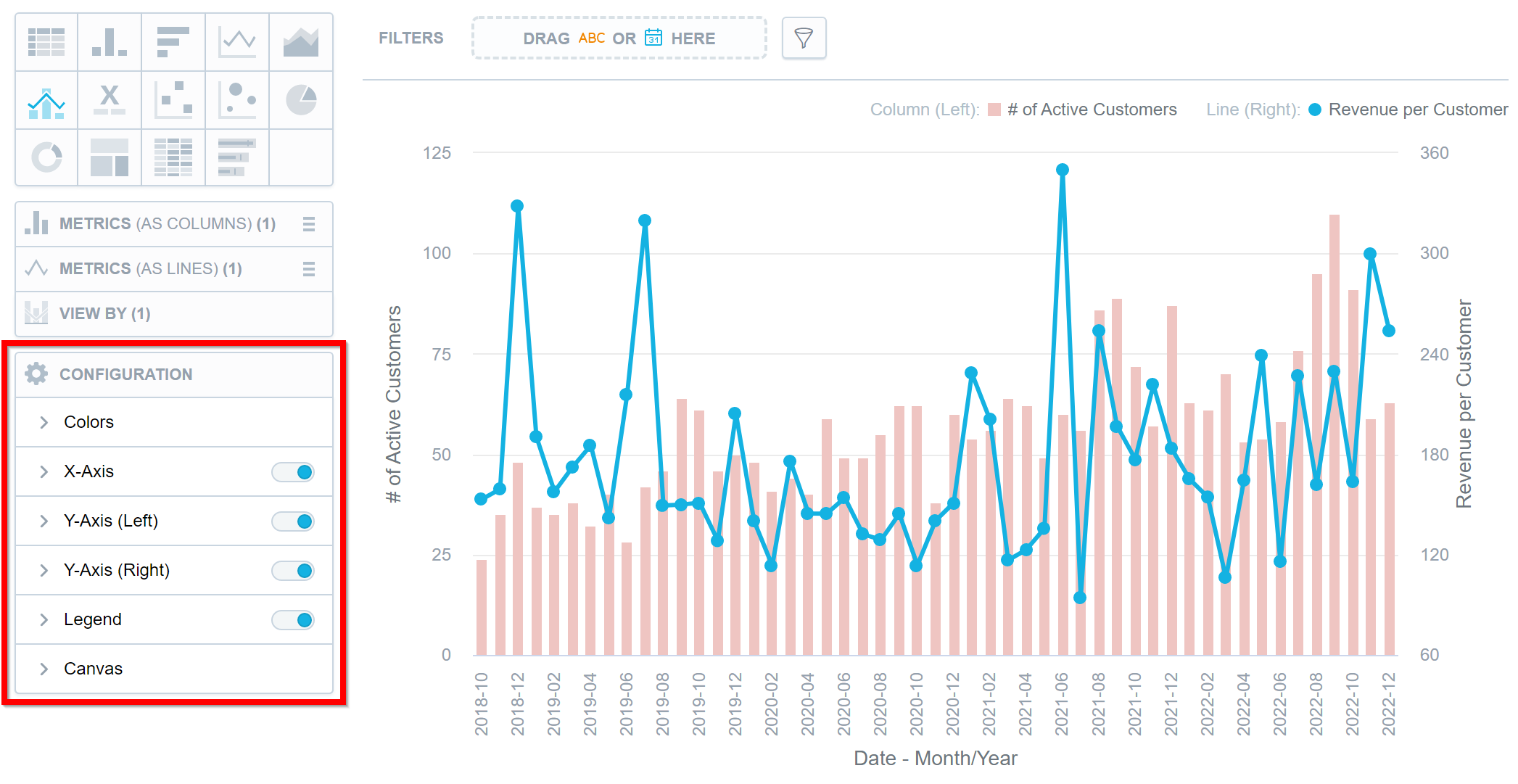
You can change the properties in the Configuration section when creating a visualization.
Axes
To hide or display axes, toggle the switch for the x-axes and y-axes.
...
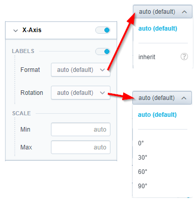
To change the display angle of the axis values, select the angle in the Rotation dropdown list.
To change the format of label values, select inherit from the Format dropdown list. The label inherits the format from the first measure in the visualization. For details about formatting, see the Format Numbers section.
To hide or display the axis name, toggle the switch for Name.
To change the position of the axis name, select the option in the Position dropdown list.
To set the minimum and maximum values for an axis, type the values in the Min and Max fields.
Legend
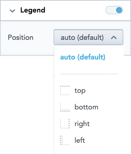
To hide or display the legend, toggle the switch in the Legend section.
To change the position of the legend, select the position in the dropdown list.
Canvas
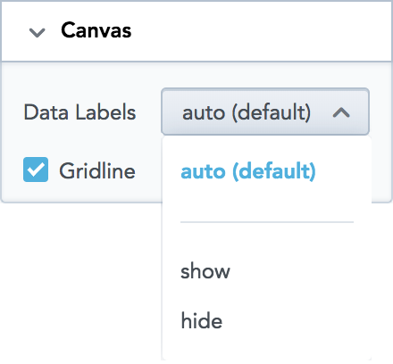
To show or hide the data labels, select the option in the Data Labels dropdown list.
To show or hide the gridline, select or unselect the Gridline option.
Change Metric and Attribute Colors
Analytical Designer assigns colors for metrics and attributes in a fixed order. The first metric/attribute in the Metric(s) section is assigned the first color from the palette (the default one or your custom palette).
...
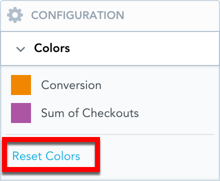
To revert to the original colors, go to Configuration → Colors and click Reset colors.
Example of a Column Chart
The image below shows a column chart that has:
...
